Maroun's market musings
Throughout 2023 and into this year, we have seen the performance of indices such as the MSCI World and the S&P 500 being driven primarily by a handful of mega-cap US names, almost exclusively within the technology space. What are the implications of this and does it really matter?
Firstly, we need to zoom out a little and look at today’s concentration in the context of history to really understand whether what we’re witnessing today is really out of the ordinary.
As we can see from Figure 1, we’re at levels now in the US last seen during the ’Nifty Fifty’ era of the early 1970s. For those who were not present during that time (I, for one), the Nifty Fifty was a term used to describe a collection of blue‑chip stocks in the US that were touted to be ‘one decision’ (i.e. you would just buy and hold these stocks, period). These stocks were so well loved that their valuations become quite stretched. However, from around 1973 onwards, these stocks cratered and went on to underperform the broader equity market. Since then, we’ve never seen the top five companies in the USA command a 25% market share of the US equity market – until now.
Today, we’re seeing similar enthusiasm levels for the top end of the market, the so‑called ‘Magnificent Seven’. Granted, the starting point in terms of valuations for the Magnificent Seven today is much less than the Nifty Fifty that preceded them. Time will tell whether this will be enough to spare them a similar fate in terms of underperforming future equity returns.
Table 1 on the following page is a chart that looks at the top 10 largest stocks in the world, at the start of each decade.
The first thing that stands out is how the composition radically changes over time. Each decade tends to be dominated by a big theme, and the stocks at the top of the list tend to reflect that. In the 1980s it was oil, and six of the top 10 were in the broader oil industry. In 1990, it was Japan’s seemingly unstoppable rise, and eight of the largest 10 stocks in the world were Japanese. In 2000, it was the dot.com bubble, and eight of the top 10 were from the TMT sector. A decade later, it was China’s turn to take over the world, and most companies in the top 10 (with perhaps the exception of Microsoft) were companies that were either Chinese, or exported a lot to China, and thereby China was a big source of growth.
Interestingly, each subsequent decade has only seen one or two names in its top 10 that were present in the previous decade’s top 10. This highlights the lack of persistency in being able to remain a top performer for long stretches of time.
Figure 1. Share of top five companies by market cap in S&P 500: 1966 – 2023
Top five annotated through history
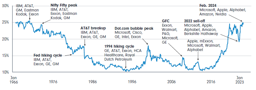
Source: DB Asset Allocation, Deutsche Bank.
Table 1. The world’s 10 largest companies by market capitalisation (ex Berkshire and Aramco)
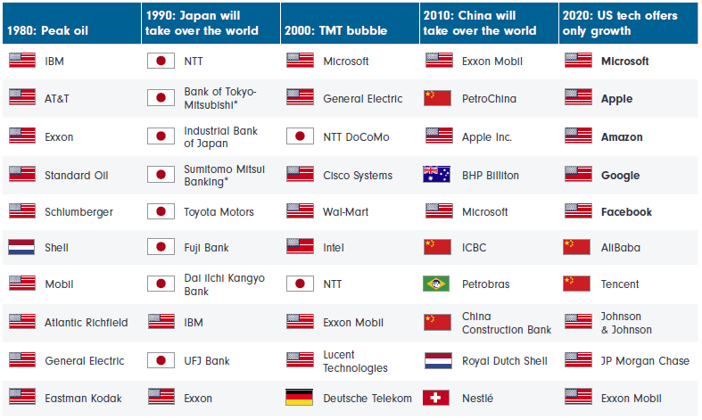
*Merged entities
Source: Gavenkal Data/Macrobond
So, what if an investor had, at the start of each decade, created a portfolio for themselves comprised entirely of the most dominant stocks of the time? I went through this hypothetical exercise myself.
I took the 10 largest stocks of each decade from the previous chart, calculated their subsequent returns for the following decade (e.g. the 1980 cohort had its performance calculated from 1 January 1980 to 1 January 1990), and created a simple, equal‑weighted portfolio. I then compared this to the returns delivered by the MSCI World Index for the same subsequent time period.
Figure 2. Cumulative returns over the subsequent decade
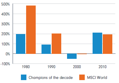
Source: Fidelity International
In all but the 2010 vintage, our investor would have underperformed the broader market by investing in the mega‑cap names of the time. And if we strip out Apple from the 2010 portfolio it, too, would have significantly underperformed the broader market. Apple delivered a cumulative return of almost 1100% from 2010 to 2020, vs the MSCI World of ~180%. If you missed Apple in 2010, then once again you would have been better off investing in the broader market.
Analysis from GMO, this time comparing investing in the largest 10 US stocks vs the rest of the S&P 500 shows that, on average, since 1957, you would have underperformed. However, since 2013, investing in the mega-caps has been a winning strategy. Whilst unusual, this is not unheard of – we witnessed similar episodes in the late 1960s/early 1970’s (Nifty Fifty era), as well as in the late 1990s (dot.com and internet bubble).
Figure 3. S&P 500: Top 10 vs 490 equal weighted
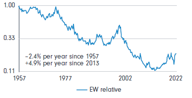
Source: Compustat, Standard & Poors
Figure 4. LTM profit ($US) of listed equities in G20 countries* by domicile, plus the Magnificnet Seven and the seven largest stocks in Europe, for comparison
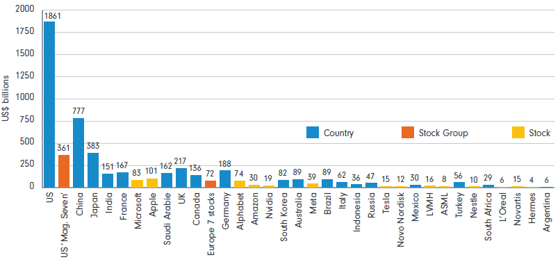
Source: Bloomberg Finance LP, Deutsche Bank. Note: aggregates are a sum of LTM net profit of common and preference stocks domiciled in a particular country, excluding stocks with a market cap below $200 m.
To be fair, most of the outperformance of the Magnificent Seven over the last decade has been driven by earnings. This has meant that, in aggregate, the NASDAQ is trading at cheaper valuations today than it did at the peak of the tech bubble in 1999. Said differently, valuation multiples for US mega‑cap tech – whilst high relative to the broader market – can get to even more elevated levels than where they are today. If their amazing run of outperformance is to come to an end, it will need to come from future earnings disappointing the lofty expectations that have been set for them.
It’s worth keeping in mind that the Magnificent Seven are now more akin to countries, rather than companies, with respect to their sheer scale (see Figure 4). For example, Apple alone generates annual profits equivalent to over half of all French listed stocks (or German, for that matter), and more than the total profits generated by the entire Australian market. In aggregate, the Magnificent Seven generate profits roughly equal to the entire Japanese stock market, or around half of the entire Chinese market.
So the question now is: Can companies the size of individual developed nations continue to grow at breakneck speed and, if so, for how long?
On top of the sheer element of size (law of large numbers is a headwind here), there’s also an element of circularity to this, as well. Nvidia has been by far the standout performer amongst the group in 2024. The revenues it generates in its Data Centre division (which accounts for ~80% of group revenues) is equivalent to ~40% of the cloud capex currently being spent by Amazon, Google, Meta and Microsoft combined.
Figure 5. Nvidia data centre revenue as a percentage of Amazon/Google/Meta/Microsoft capex
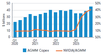
Source: Platformonomics.com
Obviously, Nvidia is selling GPUs to more than just these four customers, and the total capex spend of this cohort of customers is going on not just GPUs, but a whole bunch of other things as well (think of CPUs, DRAM, NAND, network switches, etc.). But it nevertheless does highlight how Nvidia’s fortunes are closely tied to its fellow mega-cap brethren – and if one or more of this group of important customers needed to scale back cloud investment for whatever reason, it could have contagious effects.
The end of the reign of US mega-cap tech has been predicted for quite some time now, and to date that has proven to be incorrect. I’m not saying it’s game over for these guys from this point on, but I do think it’s prudent to think of other areas of the market that can also generate robust investor returns going forward and to diversify into them, given that history isn’t on the side of the Magnificent Seven.